

You spend eight, ten, maybe twelve hours a day staring at code. Your editor, your terminal, your IDE. Yet there’s a good chance you’re reading all of it in whatever default font your setup shipped with, squinting at a lowercase L that looks exactly like the number one, or a zero that could pass for a capital O.
It sounds like a small thing. It isn’t. Developers read far more code than they write, and the font you stare at all day directly affects how quickly you scan syntax, how easily you spot bugs, and how much your eyes ache by evening.
Here’s the good news. Switching to a well-designed best coding fonts is one of the highest-impact, lowest-effort upgrades you can make to your entire development environment. It costs nothing, takes five minutes, and can genuinely make long sessions more comfortable and less error-prone.
But with dozens of options out there, each with passionate fans, choosing one can feel surprisingly overwhelming. Ligatures or no ligatures? Free or premium? Which font actually renders cleanly in your terminal versus your editor?
This guide cuts through the noise. You’ll learn what actually makes a great coding font, get clear recommendations for the best options in 2026, see how the popular Fira Code and JetBrains Mono compare, and learn exactly how to set your new font up in VS Code and beyond. Let’s find the font that finally disappears while you work.
Strategic Summary
This guide helps you choose the best coding font for your workflow, explaining what matters and recommending the top options developers rely on in 2026.
You’ll first learn what separates a great coding font from an ordinary one. Monospacing, clear character distinction, a tall x-height, and optional ligatures are the features that reduce errors and eye strain.
The guide then covers the top free coding fonts, led by JetBrains Mono, Fira Code, and Cascadia Code. These professionally designed, actively maintained fonts cover the needs of most developers at zero cost.
You’ll get a direct comparison of Fira Code versus JetBrains Mono, since these two dominate the conversation, so you can decide which fits your style and languages best.
The guide also explains programming ligatures clearly, what they are, why some developers love them, and why others turn them off, so you can make an informed choice.
Finally, you’ll get practical setup guidance for VS Code, terminals, and IDEs, including how to enable ligatures and pick sizes that maximize readability.
Most importantly, you’ll finish able to choose confidently. Whether you want the best free all-rounder, the richest ligatures, or a font optimized for your terminal, you’ll know exactly which coding font to install and how to set it up for a smoother, more comfortable coding experience.
What Makes a Great Coding Font?
A great coding font is monospaced, clearly distinguishes similar characters like 0 and O or 1 and l, stays legible at small sizes with a tall x-height, and optionally includes programming ligatures. These features reduce errors and eye strain.
Before picking a font, it helps to know what actually matters.
The first requirement is monospacing. Every character occupies the same horizontal width, creating a clean, grid-like alignment that’s essential for reading code. This keeps indentation and columns tidy in a way proportional fonts can’t match.
The second is character disambiguation. A good coding font makes easily confused characters instantly distinct. A zero might have a slash or dot to separate it from a capital O, and the number one, lowercase L, and capital I should each look clearly different. Fonts that fail this test introduce silent bugs that are painful to hunt down.
The third is legibility at small sizes. Since developers often work at compact font sizes, a tall x-height, meaning larger lowercase letters, dramatically improves readability. Because lowercase letters make up most of your code, this small detail has a big impact on comfort during long sessions.
Finally, there’s the optional feature of ligatures, which combine multi-character operators into single symbols. These are a personal preference rather than a necessity, and we’ll cover them in detail shortly. Get these fundamentals right, and a font becomes something that quietly supports your work instead of fighting it.
JetBrains Mono: The Best Free All-Rounder
JetBrains Mono is widely regarded as the best free coding font for most developers. Created by JetBrains, it offers excellent readability, a tall x-height, multiple weights with true italics, around 138 ligatures, and clear character distinction, all at no cost.
If you’re not sure where to start, start here.
JetBrains Mono was designed specifically for developers by the team behind popular IDEs like IntelliJ IDEA, PyCharm, and WebStorm. It was built by studying the actual visual patterns developers encounter in code, and that care shows in every detail.
Its standout strength is readability during long sessions. An increased x-height makes lowercase letters larger and easier to read at small sizes, while a distinctive slashed zero and unique numeral shapes eliminate character ambiguity. This reduces the subtle friction that causes fatigue and misreads.
The font is remarkably complete. It ships with roughly 138 programming ligatures, eight weights each with true italics, thorough hinting for clean rendering across macOS, Windows, and Linux, and broad multilingual support, all in one free, open-source package.
For most developers, JetBrains Mono is the ideal first upgrade from a default font. It has everything most people need, costs nothing, and integrates seamlessly if you already use a JetBrains IDE. If you’ve never changed your coding font before, spend two weeks with this one before considering anything else.
You can also read about How to Use the CT SOS Business Search Like a Pro in 2025.
Fira Code: The Ligature Favorite
Fira Code is one of the most popular coding fonts in the world, famous for its extensive programming ligatures. Built as an extension of Mozilla’s Fira Mono, it’s free, open source, and works cleanly across every major editor and terminal.
If ligatures are your priority, Fira Code is the benchmark.
Fira Code pioneered the widely adopted ligature system for programming fonts and remains the standard against which others are measured. It extends Mozilla’s Fira Mono with a huge library of ligatures that merge common multi-character sequences into single, cleaner glyphs.
Its defining feature is that ligature coverage. Sequences like the not-equals operator, arrow functions, and comparison chains render as unified symbols, reducing visual clutter in symbol-dense code. Crucially, this only changes how the code displays, not the underlying characters, so copying and pasting preserves everything exactly.
Fira Code is especially loved by developers working in operator-heavy languages. Its ligature set is broad enough to cover functional languages and modern web development workflows, making dense code easier to scan at a glance.
It’s also incredibly well supported. As one of the most popular coding fonts on GitHub, it has the largest community ecosystem of themes, guides, and configurations, and it works flawlessly across VS Code, Vim, Neovim, and all major terminals. If you want maximum ligature coverage for free, Fira Code is the clear pick.
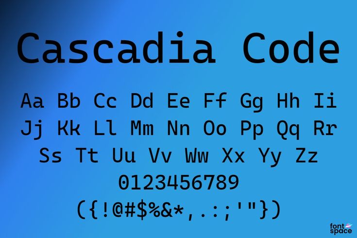
Cascadia Code: Best for Windows and Terminal
Cascadia Code is Microsoft’s official coding font, designed for Windows Terminal and Visual Studio Code. It’s free, includes ligatures, offers a no-ligature Cascadia Mono variant, and provides excellent terminal support with Powerline glyphs.
Windows and terminal users have a purpose-built option here.
Cascadia Code is Microsoft’s open-source monospaced font, originally created for Windows Terminal and now the default in several Microsoft developer tools, replacing the older Consolas. It represents a meaningful quality upgrade with a friendly, modern personality.
Its terminal strengths stand out. Because it was built for Windows Terminal, it renders exceptionally well there and includes Powerline glyph support for status-line prompts, making it a natural fit for customized terminal setups using tools like Oh My Zsh or oh-my-posh.
The font offers helpful flexibility. Cascadia Code includes programming ligatures, some designed with PowerShell scripting in mind, while Cascadia Mono is the identical font with ligatures removed for those who prefer none. There’s even a distinctive cursive italic style you can enable or turn off.
While it shines brightest on Windows, Cascadia Code also renders beautifully on macOS and Linux terminals. If you work primarily in Windows Terminal or want a slightly more compact, modern feel with strong terminal integration, it’s an excellent and completely free choice.
Other Excellent Coding Fonts to Consider
Beyond the top three, strong options include Source Code Pro and Hack for clean no-ligature readability, Iosevka for deep customization, IBM Plex Mono for a professional look, and premium fonts like MonoLisa for those wanting extra refinement.
The big three aren’t your only options. Several other fonts serve specific needs well.
For developers who prefer no ligatures, Source Code Pro and Hack are outstanding. Adobe’s Source Code Pro offers a clean, neutral aesthetic with excellent readability, while Hack is engineered specifically for maximum clarity at small sizes, with a dotted zero and clearly distinct characters. Both are free and time-tested.
For maximum customization, Iosevka is unmatched. It’s a build-your-own font with a powerful configuration system, letting you adjust character width, spacing, stylistic sets, and exactly which ligatures to include. It’s ideal for developers who want a font tailored precisely to their taste.
For a distinctive professional look, IBM Plex Mono delivers a polished aesthetic with strong multilingual support, and Ubuntu Mono brings the clean lines of Ubuntu’s design with a true italic variant.
If you’re willing to pay, premium fonts like MonoLisa are designed to reduce eye strain while looking more refined than typical monospace fonts, offering Powerline symbols, broad language support, and toggleable ligatures. For most people, though, the excellent free options are more than enough.
You can also read about Genesis Finance Explained: Best Loan and Lease Options in 2025.
Fira Code vs JetBrains Mono: Which to Choose?
Choose JetBrains Mono for the best all-round experience, with a taller x-height, eight weights, true italics, and a refined ligature set. Choose Fira Code for the most extensive ligature coverage, especially in operator-heavy languages.
These two dominate the conversation, so let’s compare them directly.
Both are free, open source, actively maintained, and work everywhere. You genuinely can’t go wrong with either, which is why they’re the two most recommended coding fonts in 2026. The differences come down to nuance and personal preference.
JetBrains Mono tends to win on overall readability. Its taller x-height makes it especially comfortable at small sizes, and its eight weights with true italics integrate cleanly with syntax highlighting themes. Its ligature set is strong but slightly less aggressive, which many developers prefer for being clear rather than decorative.
Fira Code wins on ligature breadth. If you work heavily in languages that lean on operators, like Rust, Haskell, or symbol-dense functional code, Fira Code’s larger ligature library may handle those sequences more thoroughly. Some developers find its ligatures a touch more decorative, which is either a plus or a minus depending on taste.
The best approach is simple. Start with JetBrains Mono for two weeks. If you write a lot of JavaScript, TypeScript, or operator-heavy code and want richer ligatures, try Fira Code for another two weeks. Whichever keeps you in flow longest is your font.
Understanding Programming Ligatures
Programming ligatures are display-only glyphs that merge multi-character operators, like != or =>, into single symbols. They don’t change your actual code, and they’re a visual preference some developers love and others disable.
Ligatures generate a lot of debate, so here’s what you need to know.
A ligature is purely visual. When you type an operator like the not-equals sequence, the font renders it as a single, unified glyph. Importantly, the underlying characters in your file never change. If you copy and paste the code, you get the original individual characters back exactly as typed.
Supporters find ligatures make code easier to scan. Compound operators become visually distinct and cleaner, reducing clutter in symbol-heavy code. For many developers, this creates a smoother reading experience once they’re used to it.
Critics, however, find them distracting or even confusing. Beginners in particular may benefit from seeing the exact characters that make up each operator, rather than a merged symbol that hides the underlying syntax. Some experienced developers simply prefer literal clarity.
The good news is that ligatures are always optional. You can toggle them on or off in your editor’s settings. The honest recommendation is to try them for a week in a font like JetBrains Mono or Fira Code, then try a week without, and keep whichever genuinely feels better for the languages you actually write.
How to Set Up Your Coding Font
To use a new coding font, download and install it, then set it as your font family in your editor. In VS Code, open Settings, search for Font Family, and enter the font name, then enable font ligatures if desired.
Installing a new font takes just a few minutes.
First, download the font. The top free fonts are available from their official sources, such as the JetBrains website for JetBrains Mono, or the official GitHub releases for Fira Code and Cascadia Code. Install it like any font on your system by opening the font file and confirming installation.
For VS Code, which defaults to Consolas on Windows and Menlo on macOS, open Settings, search for Font Family, and enter your font name, for example listing your chosen font followed by a monospace fallback. To turn on ligatures, enable the font ligatures setting.
For terminals, configure the font explicitly in your terminal’s preferences, since terminals don’t always pick up newly installed fonts automatically. If you use fancy prompts with Powerline symbols or tools like Powerlevel10k, install a Nerd Font patched version of your chosen font so the icons render correctly.
On font size, most developers find 12 to 14 pixels comfortable on standard displays and slightly larger on high-DPI screens. A helpful tip: eye strain is more often caused by too-small a font size than by the font itself, so if you’re leaning toward your screen, size up before switching fonts.
You can also read about How In Housing Finance Supports First-Time Home Buyers.
Frequently Asked Questions
Q: What is the best coding font in 2026? A: JetBrains Mono is widely considered the best free all-rounder, followed closely by Fira Code and Cascadia Code. All three are free, professionally designed, and actively maintained.
Q: What makes a font good for coding? A: It should be monospaced, clearly distinguish similar characters like 0 and O or 1 and l, stay legible at small sizes with a tall x-height, and optionally support programming ligatures.
Q: Should I use a font with ligatures? A: It’s a personal preference. Ligatures make compound operators visually distinct, which some find easier to scan, and others find distracting. Try them for a week, then decide.
Q: Fira Code or JetBrains Mono, which is better? A: Both are excellent and free. JetBrains Mono offers better all-round readability and more weights, while Fira Code has more extensive ligature coverage for operator-heavy languages.
Q: What is the best font for VS Code? A: JetBrains Mono and Fira Code are top choices. Set your preference under Font Family in Settings, and enable font ligatures if your font supports them.
Q: What is the best font for the terminal? A: Cascadia Code is excellent for terminals, especially Windows Terminal, with Powerline support. For custom prompts, use a Nerd Font patched version of your chosen font.
Q: Are the best coding fonts free? A: Yes. Most top coding fonts, including JetBrains Mono, Fira Code, and Cascadia Code, are completely free and open source, so there’s no reason not to upgrade from a default font.
Conclusion: Find the Font That Disappears
So what’s the best coding font? The honest answer is the one that disappears while you work, letting you focus on the code instead of noticing the characters or squinting at ambiguous symbols.
Remember that default font from the opening, the one making you second-guess whether that’s a one or a lowercase L? You don’t have to put up with it. A better font is a five-minute, zero-cost upgrade that pays off every single day you code.
The key takeaways are simple. Start with JetBrains Mono, the best free all-rounder for most developers. Reach for Fira Code if you want the richest ligatures, or Cascadia Code if you live in the terminal, especially on Windows. And remember that ligatures are entirely a matter of personal taste.
The best font is ultimately subjective, but it’s subjective within a framework of real, objective qualities: clear characters, strong small-size legibility, and clean rendering. Any of the fonts here delivers those.
Your next step is easy. Pick one, install it, set it in your editor, and spend two weeks actually coding with it. If it keeps you comfortable and in flow, you’ve found your font. If not, try another from this list until one clicks.
Which coding font are you using right now, and are you a ligatures fan or do you turn them off? Share your setup in the comments below.